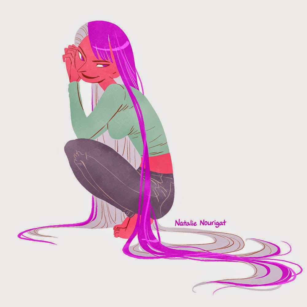
New illustration for an upcoming sketchbook~! Stay tuned for info on that, it's a little different than my past sketchbooks. ;)
Here's a gif of this illustration coming together:
And yes, I straight-up copied this Ryan Andrews color palette. :>
Showing posts with label illustration. Show all posts
Monday, April 20, 2015
Thursday, April 16, 2015
Summer Boys illustrations and breakdown / tutorial
The sun is coming back to Portland and people are coming out of hibernation...! I got to go to dinner with some good friends from high school last night, and when I got back to my studio, I was super inspired. I ended up staying downtown 5 more hours to work on a series of Summer Boys!
People have expressed interest in breakdowns/tutorials when I post illustrations, so here's a little information about the method I was using on these pieces~
I recently downloaded this set of Photoshop brush presets from JP Vine for the animation storyboarding I've been doing this year. (I love it -- highly recommended!) For these illustrations I used 2 presets from the pack: [BLACK] PENCIL and GRAPHITE POWDER. The rest was drawn with the good ol' Photoshop pencil tool.
So here's the line art, just drawn with that brush preset [BLACK] PENCIL (7 pixels). Loose, gestural, imperfect, and zoomed out at 50% for most of it.
On a layer below the line art, I used the pencil tool to roughly trace the interior of the figure with some color.
On a layer above the color layer and below the line art layer, I used the [BLACK] PENCIL brush preset (after increasing the brush to 80 pixels and selecting a warm gray color) to add some shadows. I kept the brush strokes large and a little abstract, trying to mimic what I do in my sketchbooks with the Pentel pocket brush pen:
Next I added a layer above the color and shadow layer but still below the line art called "texture". I used the GRAPHITE POWDER brush preset (increased to 1300 pixels) to add some texture all over the illustration. Then I set the layer mode to "color burn" so it only affected the colored areas and the background stayed completely white.
Ta-da~~~~
I recently downloaded this set of Photoshop brush presets from JP Vine for the animation storyboarding I've been doing this year. (I love it -- highly recommended!) For these illustrations I used 2 presets from the pack: [BLACK] PENCIL and GRAPHITE POWDER. The rest was drawn with the good ol' Photoshop pencil tool.
So here's the line art, just drawn with that brush preset [BLACK] PENCIL (7 pixels). Loose, gestural, imperfect, and zoomed out at 50% for most of it.
On a layer below the line art, I used the pencil tool to roughly trace the interior of the figure with some color.
On a layer above the color layer and below the line art layer, I used the [BLACK] PENCIL brush preset (after increasing the brush to 80 pixels and selecting a warm gray color) to add some shadows. I kept the brush strokes large and a little abstract, trying to mimic what I do in my sketchbooks with the Pentel pocket brush pen:
Next I added a layer above the color and shadow layer but still below the line art called "texture". I used the GRAPHITE POWDER brush preset (increased to 1300 pixels) to add some texture all over the illustration. Then I set the layer mode to "color burn" so it only affected the colored areas and the background stayed completely white.
Ta-da~~~~
Labels:
boys,
color,
digital,
illustration,
photoshop,
summer,
summer boys,
tutorial
Location:
Portland, OR, USA
Thursday, November 13, 2014
Illustration process breakdown - color blocks and interior line art
Hey, all! I've been experimenting with a new style recently, and I
wanted to make a post breaking it down for anyone interested in the
process:
The main difference between these illustrations and my usual style is that I don't start with line art; the figures' defining shapes are mostly separated by contrasting colors, and I only use line art, sparingly, for interior details.
Here's one figure from start to finish (all done in Photoshop):
Loose sketch, just using the pencil tool
Tighter drawing, still just using the pencil tool
On a new layer set to "multiply", I use the pencil tool and trace the main shapes with different colors, then fill them in.
Here's how that looks when I hide the guiding sketch layer and set the colors' layer to "normal"
Next, I add line art on a new layer with a lightly textured brush. I use a reddish tone because I like how it looks compared to just plain black line art. I use the fewest lines possible; just clarifying sections that overlap, like this guy's armpit and a few wrinkles in his clothing, plus his face. Rather than outline his front leg overlapping the back, I mute the colors in his back leg to create the illusion of depth.
Here's what the line art looks like when isolated
On a new layer, I add a texture to the figure. I select all, then subtract the negative space, so I just have the entire figure's outline selected. I use a textured brush to add a marble-y desaturated blue. This is what the layer looks like when isolated.
...And here's what it looks like when set to "color burn" and 70% opacity over the colors layer but below the line art layer. It affects dark colors more than light colors, so I noodle with opacity and sometimes darken the texture effect over light sections, like his skin and socks (which still end up having less of that textured look).
I select the entire figure again, expand the selection by about 20 pixels, invert the selection, and fill the background layer with a color I like.
Ta-da! :D
Ta-da! :D
Labels:
character design,
characters,
figures,
illustration,
process,
tutorial
Location:
Portland, OR, USA
Subscribe to:
Posts (Atom)