
Hey, all! I've been experimenting with a new style recently, and I
wanted to make a post breaking it down for anyone interested in the
process:

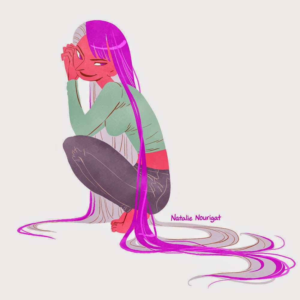
The main difference between these illustrations and my usual style is that I don't start with line art; the figures' defining shapes are mostly separated by contrasting colors, and I only use line art, sparingly, for interior details.
Here's one figure from start to finish (all done in Photoshop):

Loose sketch, just using the pencil tool

Tighter drawing, still just using the pencil tool

On a new layer set to "multiply", I use the pencil tool and trace the main shapes with different colors, then fill them in.

Here's how that looks when I hide the guiding sketch layer and set the colors' layer to "normal"

Next, I add line art on a new layer with a lightly textured brush. I use a reddish tone because I like how it looks compared to just plain black line art. I use the fewest lines possible; just clarifying sections that overlap, like this guy's armpit and a few wrinkles in his clothing, plus his face. Rather than outline his front leg overlapping the back, I mute the colors in his back leg to create the illusion of depth.

Here's what the line art looks like when isolated

On a new layer, I add a texture to the figure. I select all, then subtract the negative space, so I just have the entire figure's outline selected. I use a textured brush to add a marble-y desaturated blue. This is what the layer looks like when isolated.

...And here's what it looks like when set to "color burn" and 70% opacity over the colors layer but below the line art layer. It affects dark colors more than light colors, so I noodle with opacity and sometimes darken the texture effect over light sections, like his skin and socks (which still end up having less of that textured look).

I select the entire figure again, expand the selection by about 20 pixels, invert the selection, and fill the background layer with a color I like.

Ta-da! :D

Ta-da! :D
So cool. I was actually able to follow along! Thanks for sharing this process :)
ReplyDeleteYay! :D It's my pleasure.
DeleteDo you make your own brushes, Tally? Or do you use what was already in PS?
ReplyDeleteOh thanks Chynna, I should have mentioned that! I download brush packs now and then, and the one I've gotten the most use of, which contains both of the brushes mentioned in this post, is this free brush pack by Chris Wahl: http://chriswahlartbrushes.blogspot.com/2011/01/cwahl-megapack-60-brushes-one-download.html
DeleteAwesome, thank you for the link! Very cool.
DeleteIs there a reason you use photoshop rather than a vectorial drawing software (such as inkscape or illustrator)?
ReplyDeleteIt's just habit; I've been working with Photoshop for 10 years, but I JUST subscribed to the Creative Cloud and got access to Illustrator. I need to explore it. :)
Delete